top of page


Media theories played a key role in how I shaped my products as I used them as the basis of how I appealed to audiences in order to create the most suitable video, digipak, and website. In this way, I used the conventions of existing products that adhered to these theories as well as key aspects of the theories themselves.
THEORIES
A lot of the key aspects of Goodwin's theory regarding music video content was met with my own video. Both my audience interviews and industry research confirmed that these were important features that audiences wanted to see in music videos as they played an important role in making it appear professional and tie in with artist promotion.
My video conveyed characteristics of the genre of the music, which was electropop. My research into the pop- and more specifically electropop- genre informed me that the videos often have bright colours and feature a mix of narrative and performance. This also coincided with my audience research that confirmed that this mix was, overall, the most preferred style of video. My video was mostly narrative but did include moments (particularly in the chorus) where the artist can be seen lip-syncing in a way that clearly shows the divide between the narrative aspects of the video and the performance. The overall colour palette was vibrant, especially the happier scenes filmed in summer (with natural sunlight and colours of the outdoors- filmed in Beverly Park) and in the arcade (neon and coloured lights- filmed in Brighton), which again showed genre characteristics of electropop music. I also used iconography in my video with the recognisable sight of the London Eye and Brighton Pier, which again draws on conventions of the pop genre.


Something that I paid particular attention to was the relationship between the lyrics/music and the visuals, and this often shaped how it was filmed an edited in order to put emphasis on particular phrases or musical cues. In the chorus of the song there is a lyrics which says "till our wide eyes burn blind", which I visually portrayed with two overlapping shots of a sunset and an extreme close up of an eye so that the sun looked like it was shining through in her gaze to both illustrate and amplify those lyrics. Another time in particular that I connected the lyrics and the visuals was in the second pre-chorus when the words "but I won't look back" can be heard, however I used disjuncture here between the two as I showed one of the characters doing the opposite to what the lyrics say by looking over her shoulder. This was in order to further express the conflict between the characters and hint at a possible resolution as they haven't given in to the loss of hope just yet and will still "look back". It also relates to the overall message of the video about memories and reflection.
The relation between the music and visuals was mostly to amplify the effect of the song and immerse the audience in it. Throughout I made sure to cut on beat, and especially utilised this technique in the bridge when the percussion rhythm is particularly strong and so I used a different clip on each new beat. This sped up the pace and worked with the music to build up to the dramatic reunion, which is another example of how I related the music and the visuals. Just before the breakdown, the music suddenly stops and there is a click sound which I linked to a clip of a cigarette lighter flaring up, then when the music comes back in the transition effect of a white flash over the screen emphasises the return of all the instruments in full force. The theorist Vernallis suggested that music videos require editing and camera movements that are in time with the music, and that each shot should last only a few seconds. This is a key convention that I made sure to include, as all music videos that I watched for research had this formula too.
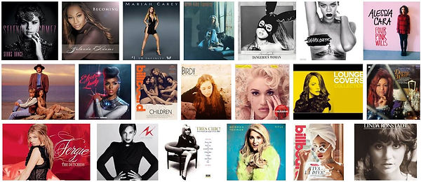
Another feature of Goodwin's theory that I included was the record label's need for close-ups of the artist. Not only are there multiple close-ups of her in the music video (both lip-syncing and not), but the digipak has a clear head shot of her right on the front cover as the central and defining feature. When I was researching pop album covers (particularly female pop artists), I noticed that this was essential to have, and while I did develop my design of the cover to be more personalised to my artist (details on the next page), this convention I followed directly. I also created a visual style, which is also something that many theorists agree is key in the creation of an artist personality; no matter the genare. This may be an aesthetic, a signature logo or pose/dance move. For my artist, it was more directed to the aesthetics of the video (with the motif of the sky, sunsets, and details of nature being noticeably present troughout) and how the other products that were linked to her shared this style. The pink and blue font is also part of her branding and style, as the warm pastel shades work well with the colourful sky imagery and further the overall aesthetic of the artist.


bottom of page